Diana and the Dolphin: Writing and Illustrating a Licensed Picture Book

At the very beginning of this year, my author-illustrator debut hit bookstores! Diana and the Dolphin, A Tale of Heroic Kindness is the first published book I’ve written and illustrated, and it was such a joy to traipse around Portland and read it to kiddos in bookstores. It’s been a little over 3 months since it was released, which means that I’ve had enough space from it to write a bit about how I made this book and the process of working with a licensed property.
HOW IT STARTED
It all began in June of 2023, when my agent sent out an email with a collection of my work to their list of editors and art directors. The email included some of my picture book work, and some of my older-leaning graphic novel art, and I think this combination of things caught the eye of an editor from Random House, who responded, wondering if I might be interested in a children’s book about Wonder Woman.

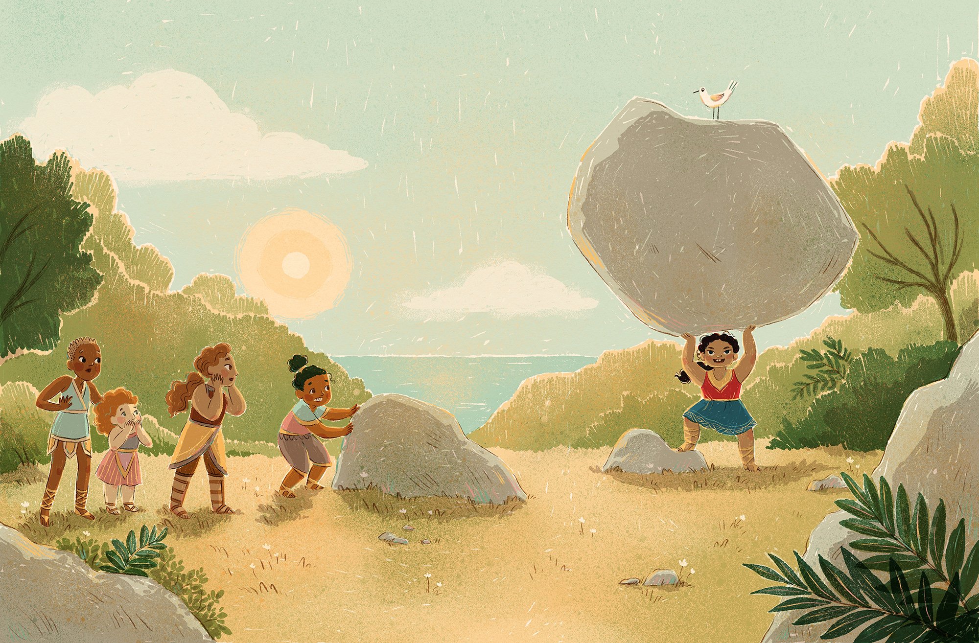
Interior illustration from Diana and the Dolphin, by Chamisa Kellogg (Random House)
It took me a minute to get used to the idea. I had never considered writing a story about an existing character, much less one as well-known as Wonder Woman! It felt like a lot of pressure, and I couldn’t quite see how I would make it my own while still fitting into the larger WW brand. But, as I did a little research into the character, her world and the origin of the Wonder Woman comic books, I became more excited and started to see a way I could put my spin on it. If you’re curious about how Wonder Woman came to exist, or are generally interested in the history of comics, I highly recommend The Secret History of Wonder Woman by Jill Lepore. I also read A Lot Like Batman, a wonderful picture book by Keith Negley also published by Random House, and I loved what he did with the character and how he made it relevant for younger kids.
PITCHING IDEAS
Since I was being asked to both write and illustrate this book, the process started with pitching story ideas. I spent a few weeks coming up with ideas and bouncing them off my agent, to get a sense of whether the folks at Random House and DC might like them. When you work with a licensed property, the publisher (licensee) and the licensor — in this case DC comics — have to sign off on each stage. In the end, I sent about 5 story ideas, each one a couple of sentences long. One of these was the story of Diana and the Dolphin, the one that became the published book.

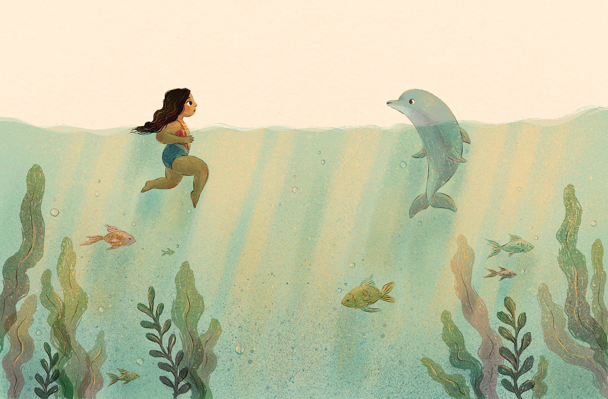
Interior illustration from Diana and the Dolphin, by Chamisa Kellogg (Random House)
Once Random House and DC were both satisfied with the story idea, we signed the contract. Unlike most picture book contracts, this was a work-for-hire agreement without royalties, meaning it was a flat fee payment rather than an advance against future royalties earned. I usually wouldn’t agree to a work-for-hire contract for a picture book, since it means you are signing over the rights to the artwork, but they are much more common when working with a licensed property, and the fee was much higher than I’ve ever been paid for a book. I was excited about the opportunity to write a book for the first time, and I was intrigued by the subject matter and the challenge of working with an existing character. For me, these things combined with the substantial fee, balanced out the fact that it was work-for-hire. There are lots of things that you have to take into account when considering a contract, and it’s ultimately up to the author/illustrator to decide what they’re comfortable with.
WRITING THE STORY
Once the paperwork was signed, I moved on to writing the story. I’m not as confident with my writing skills as I am with illustrating, and it took me a while to get to a point where the story felt like it was hitting the right notes, and that Diana’s character was coming through clearly. I wanted to write a story for kids who understand what it means to be told they’re “too much” and somehow convey to them that their “too-muchness” is the very thing that makes them great. I am so very grateful to my wonderful critique group partners, Heidi Aubrey and Liz Goss (both wonderful author-illustrators themselves), who helped me get this story to a point where I was proud of it, and to my editor Dennis Shealy at Random House, who gave excellent feedback and suggestions and always made me feel like I had creative control.


MOOD BOARD AND CHARACTER SKETCHES
While waiting for feedback on the manuscript, I started on character sketches. Wonder Woman is such a recognizable character and has been interpreted by so many artists over the years, so this was a daunting task. I spent a good amount of time on Pinterest pulling references from the decades of comic books, movies and other media that have featured this character. I also went down a bit of a rabbit hole about the semi-mythological Amazons, fierce female warriors that are said to have existed in ancient Turkey and Greece. William Moulton Marston, the original creator of Wonder Woman, based Diana and the all-female island where she is born, on the Amazons. I also took a lot of inspiration from ancient Greek and Turkish pottery, patterns, architecture and clothing. See my Pinterest mood board above.

Character sketches for Diana and the Dolphin
Diana and the Dolphin shows Wonder Woman mainly as a little girl, but also as a teenager and an adult, so I made sure I knew how I would draw her at all those ages. It was important to me that both as a child and an adult Diana looked strong and muscular, and that her body type was realistic for the kind of strength she possesses (even though we’re dealing with unrealistic superhero strength here). Wonder Woman, like many female superheroes, has been drawn in a hyper-sexualized way since forever, often by male artists. I wanted to add a perspective that felt more focused her strength rather than her sex appeal, firstly because this is a book for kids, but also because I firmly believe it’s important to shift the narrative towards the idea that strength is sexy, and having more images out in the world of strong, round, chunky woman who are not catering to the stereotypical male gaze, is important. My sister tells me that when she reads Diana and the Dolphin to my little nephew and they get to the page where Diana is lifting a giant bolder, he will sometimes whispers “She’s strong!” and I cannot quite express how much this makes me feel like I have done my job with this book, to have a young boy see a female character on the page and acknowledge her strength.

Character sketches for Diana and the Dolphin
DC liked these sketches and only had a few comments about adding the eagle head motif to her swimsuit and making sure the blue was more blue than teal, so that it matched back to her iconic colors.
THUMBNAILS AND SKETCHES
With the character sketches and the manuscript approved, it was time to dive into page layout, aka sketching out the whole book! I won’t go too deep into the process here, but if you’re interested in the nitty gritty of what goes into picture book layout, this patreon post talks about my character design and sketching process for my picture book, The Pie that Molly Grew.
Here are the early thumbnails (aka tiny, rough sketches) for Diana and the Dolphin:

And here are some more developed page sketches. I like to add in value (darks and lights) to my final sketches so that when I move to the color artwork I don’t feel like I’m starting from scratch:


There was a little back-and-forth on sketches before they got approved, but for the most part it was a relatively smooth process. Everyone is weighing in at this point, including the book designer who is making sure there is appropriate space for the text on each page. It’s important to get all the feedback on layout at the sketch phase, because it’s a lot more work to implement changes to final color art later on.
FINAL ART
Once we had a set of sketches that all parties had agreed upon, I started in on final art! This book was SUCH a fun one to make the final art for. I loved drawing the landscapes and the underwater scenes and the different characters. I worked exclusively in procreate on the iPad, and like most of my other digital art, I worked in color layers set to “multiply” blending mode. This thought process is a bit like print making, where you imagine you are printing one color at a time. Even though this book is definitely not screenprinted (it is standard 4-color CMYK printing), I find that working this way is pleasant for my brain and also makes the colors feel cohesive and really sing. For finishing touches on each illustration, I added in some texture and highlights on a non-multiply layer to bring some brightness and pops of color. For a more in-depth look at how I create final kid’s book illustrations in procreate, check out this patreon post.


Once final art was done, my job had mostly come to an end. I did have to approve a few things with the text as the designer worked on layout, and I made a few small changes to the cover art to make space for logos and text. When all was said and done, the time from that first email we received from the editor until I turned in the final art was about 11 months, with the bulk of the work happening over about 6 months. Then it got sent off to the printer and I waited eagerly for my author copies of the finished, printed book to arrive (about 6 months later). The color and printing of this book turned out so beautifully! I was very happy to open up that box and see Diana and that little dolphin smiling up at me.

Woohoo! Congratulations, you have come to end of this very long post! I hope you enjoyed it.
If you would like to a copy of Diana and the Dolphin, I have signed copies in my shop!