Returning to Traditional Media
Last October I found myself with some unexpected free time, and decided to take the opportunity to make some personal work. October happens to be Inktober month, a yearly online challenge that many illustrators participate in, often attempting to create a new illustration every day of October. For a while, I had been longing to get back into some traditional media techniques, after years of focusing on my digital illustration skills. I figured this would be a good source of motivation for me to share my work, and hopefully re-learn some traditional media techniques. I definitely found that I was rusty, and that I had to reorient my brain towards a process that doesn’t allow for that digital “undo”. In the end, I found a lot of joy in pushing through mistakes and happy accidents, and I think it was useful for my digital work as well. I go into more detail on my process, materials and takeaways below.
Materials + COnStraints
My first step was to set myself some constraints, starting with my materials. I had been dabbling a bit in my sketchbook with Neocolor II water soluble pastels, and had been loving combining them with inky lines. The beauty of the Neocolor II crayons is that they can be blended with water for a watercolor effect, but they can also be used for rich texture like a traditional crayon. I also threw in colored pencils for detail and texture (a mix of prismacolor and Caran d’ache Luminance), and chose a couple of waterproof ink pens for linework (Letraset Fine Line Drawing Pen and Faber-Castell Ecco Pigment). I told myself I would stick to these materials, but later in the process I broke my rule and followed the urge to add in some Holbein Acrylic Gouache for underpaintings (more on that below).
Note: none of the above links are sponsored in any way, I’ve just included them in case you’re curious!
I know myself, and I knew I would never be able to make a painting every day of October (believe me, I have tried and failed multiple times before). Instead, I set my own goal of three paintings a week. In the back of my mind I figured I would hopefully end up with twelve paintings, which I could use for my illustrated calendar for the following year. However, I didn’t want to put too much pressure on outcomes or finished art, but instead base the “success” of this project on showing up regularly to experiment and play with traditional materials.
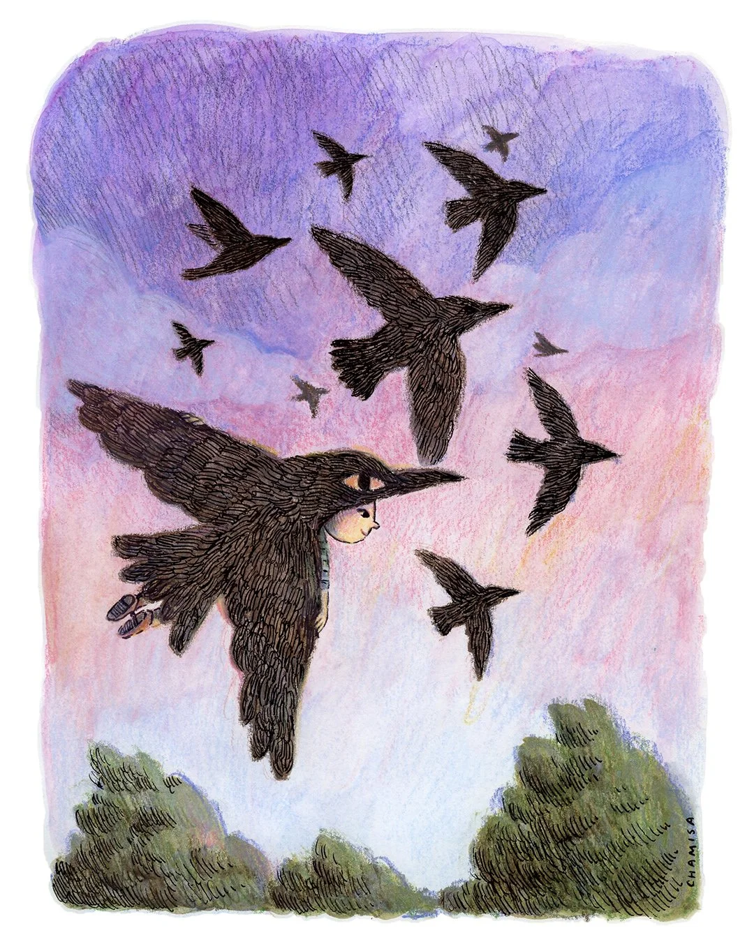
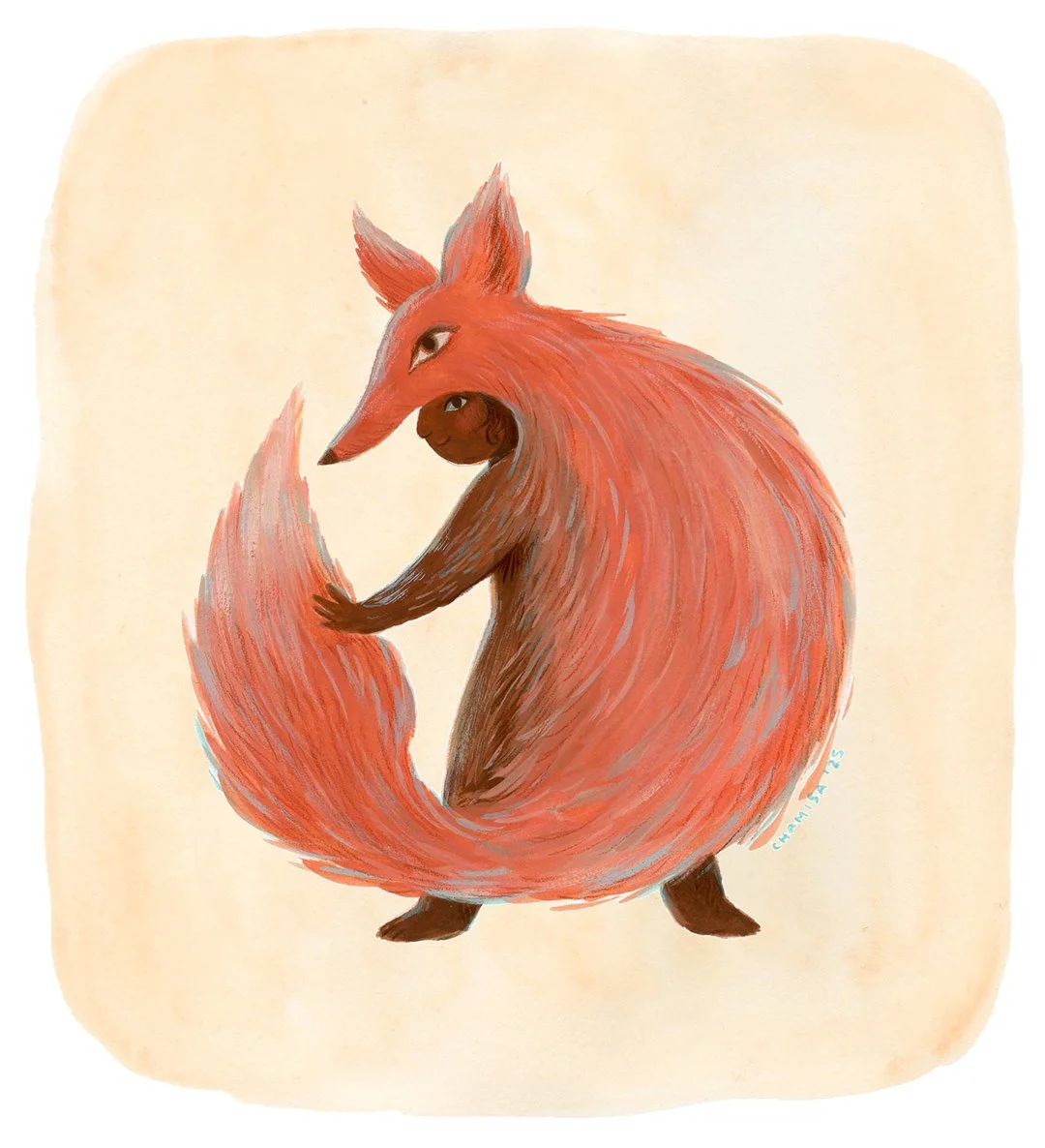
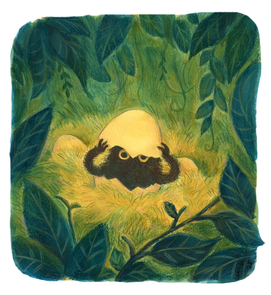
I chose a theme of “creatures” for this series of paintings. It felt just specific enough while allowing for a wide range of interpretation, and I wanted to explore a more fantastical, weird side to my work and develop some cool characters.
Process
Working with the theme “creatures” I began with a page of thumbnail ideas in late September, in preparation for this project. This turned out to be hugely helpful, because it meant I didn’t have to do the work of coming up with an idea every single time I sat down to make a painting.
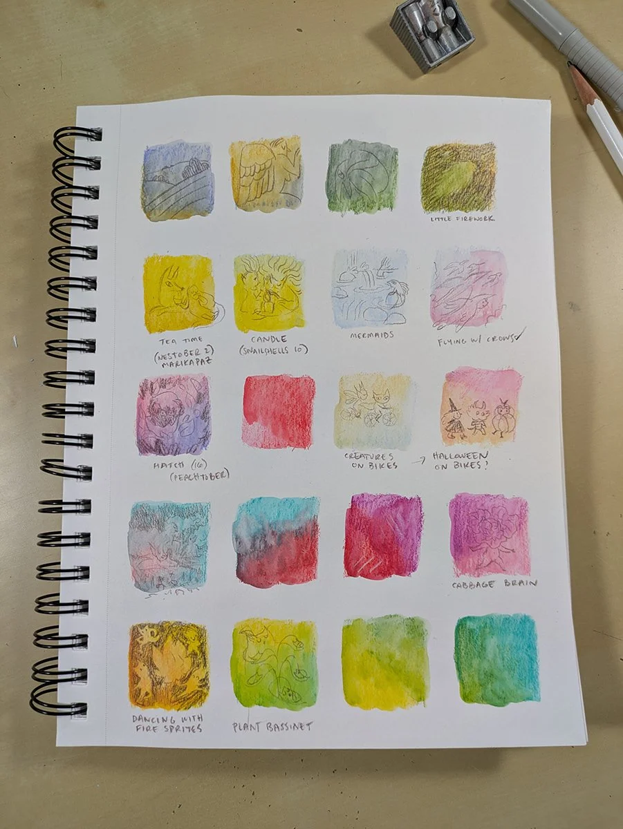
My thumbnails were pretty rough though, so each time I started a painting, I did a more detailed sketch, and then a small color study, before diving into the final art. Past Chamisa would’ve been too impatient to do these steps, but I knew that taking this extra time would mean I would be happier with my final piece.
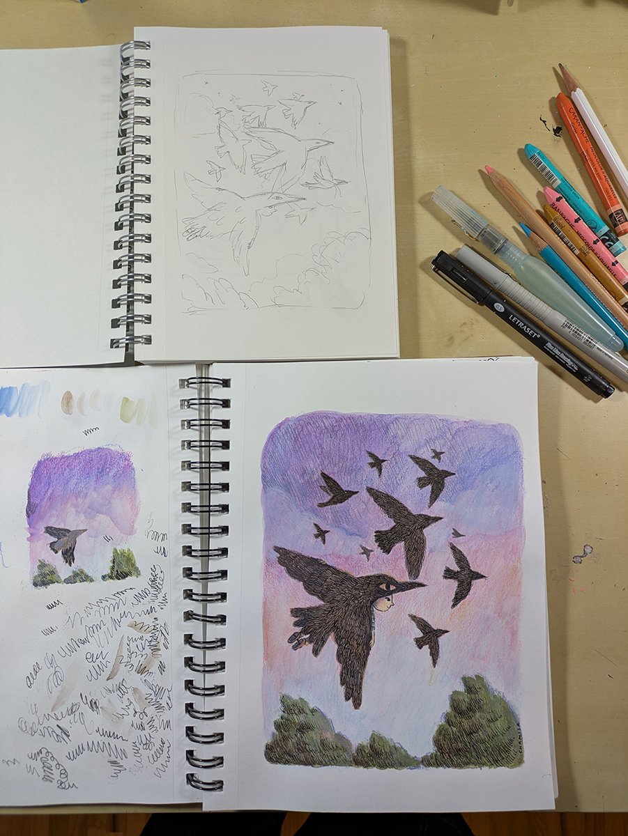
Once I was working on the final artwork, my process looked something like this:
Lightly sketching the composition in a warm-toned pencil.
Laying down a layer of neocolor II and blending it with water to form an underpainting.
Building up texture layers with different colors of crayon, and blending here and there.
Adding pen lines and filling in texture.
Adding highlights and even MORE texture with colored pencils.
I clearly love texture :)
Below, you can see an example of what my underpainting and texture layers looked like, versus what it looked like when I added the ink.
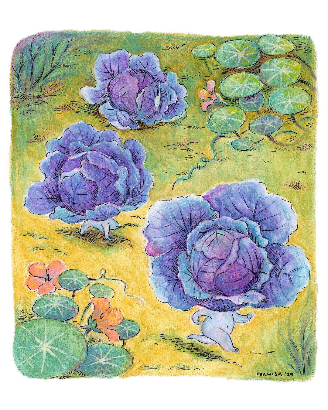
Although I loved the way the neocolors looked as an underpainting, they tended to shift a bit if I layered more water on top. I wanted the ability to have a color as a base that wouldn’t move and would shine through the other layers without getting muddy. This was when I introduced acrylic gouache, and it was sooo satisfying to get a base tone that unified the painting, like the one below where I used opera pink as a base, one of my favorite colors.
Accepting Imperfection
Having illustrated two full picture books and many personal projects digitally, I have my digital illustration process pretty fine-tuned. One huge perk of creating artwork digitally is that it is already digitized, no need for scanning and color-correcting! This was where I hit the biggest snag with this set of Illustrations: scanning them in, I just wasn’t getting a result that honored the original artwork. I’m still figuring this out. Some artist friends have suggested photographing paintings instead of scanning them, or I may just need to spend more time fiddling with my scanning and color-correction settings.
There were also many moments where I felt the colors were wrong, I had overworked a section, I’d drawn an indelible ink line in a spot that felt just slightly off, or the materials were fighting each other (doing all that ink cross hatching on top of the neocolors was less than ideal, because the pen nib kept picking up the pastels).
Ultimately, I think there is a bigger takeaway here, one that actually serves both my traditional as well as my digital process: mistakes and imperfections usually make me like my work more. Though I’ve been happy with my digital work over the last few years, the reason I felt called to return to traditional media was precisely this: it was too easy when working digitally to make things “perfect” — my digital work sometimes lacks a sense of humanity. That sneaky two-finger tap in procreate magically reverses your last stroke so that you have infinite chances to get it right, when the first line you drew might actually be the one that’s best. In the end, the struggle was what made me feel like I’d had a breakthrough with this “creatures” series.
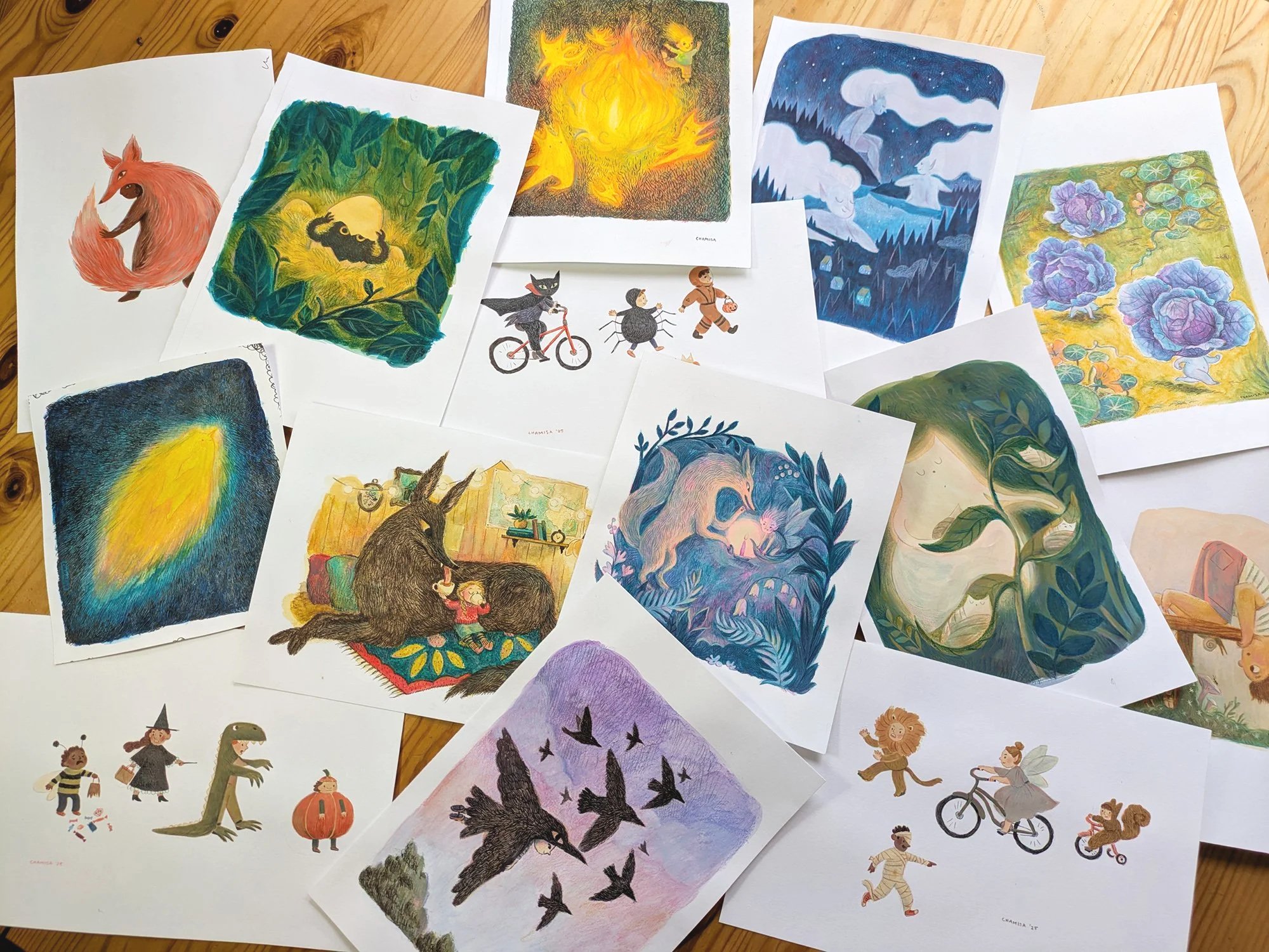
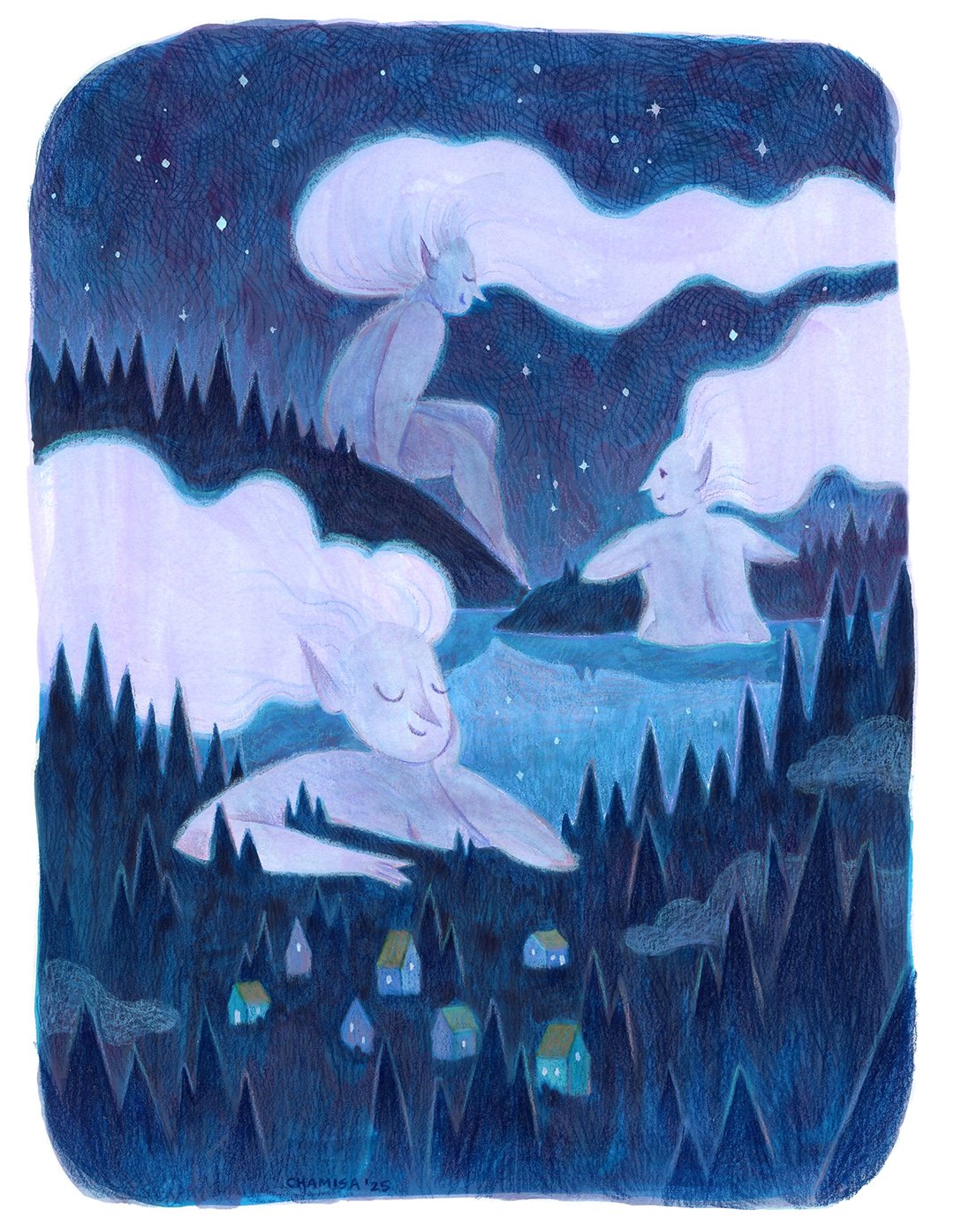
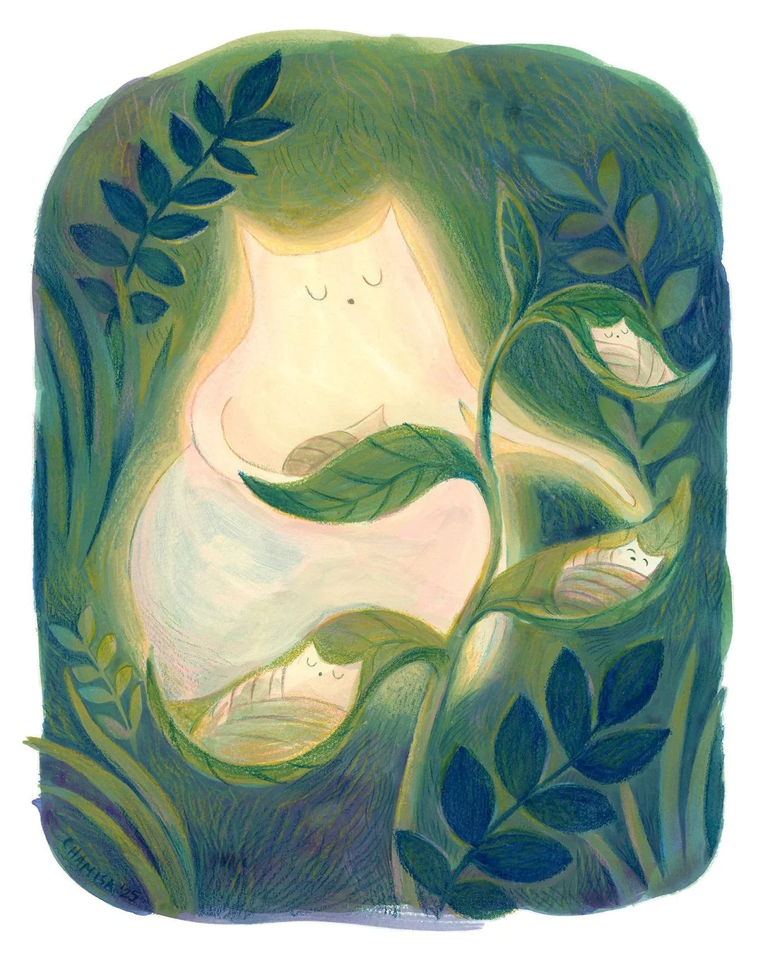
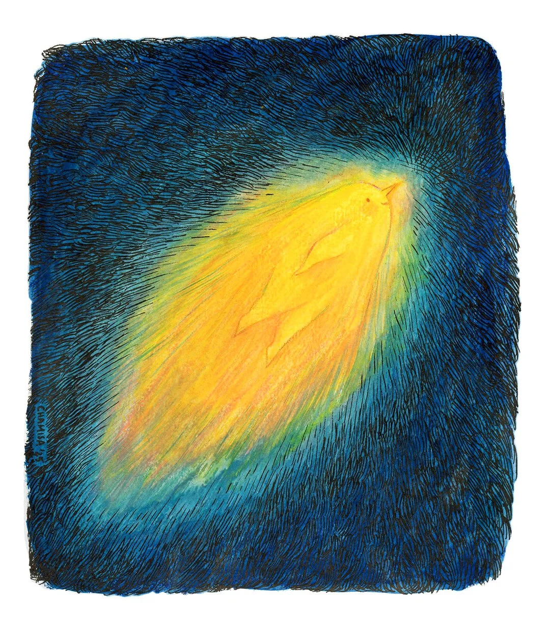
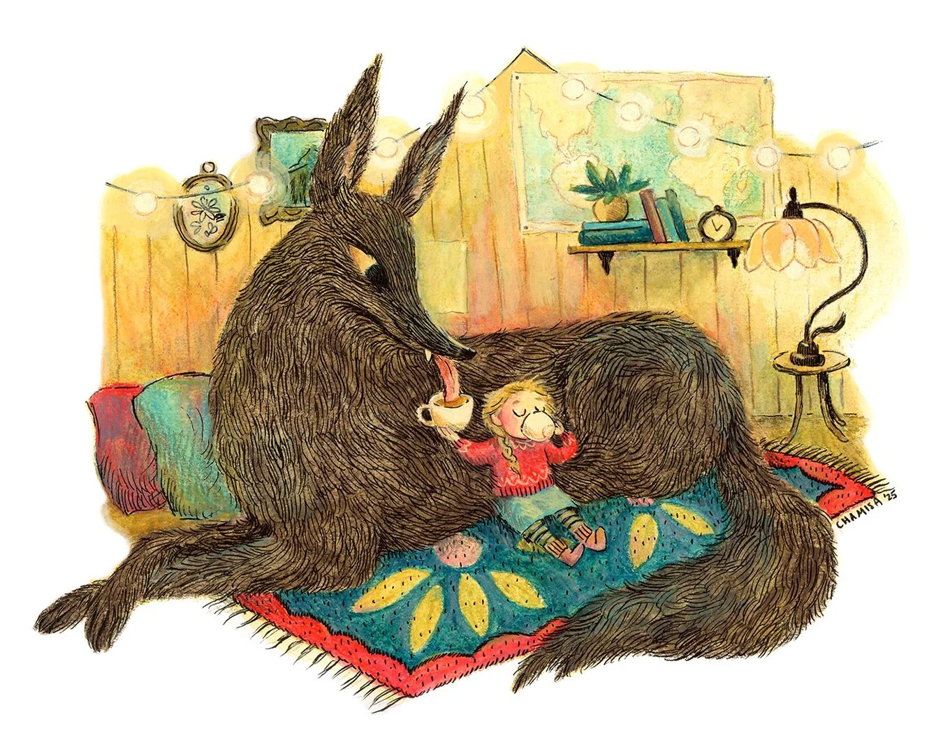
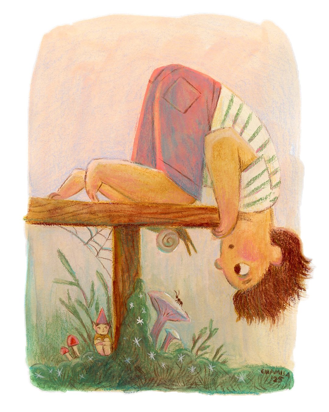
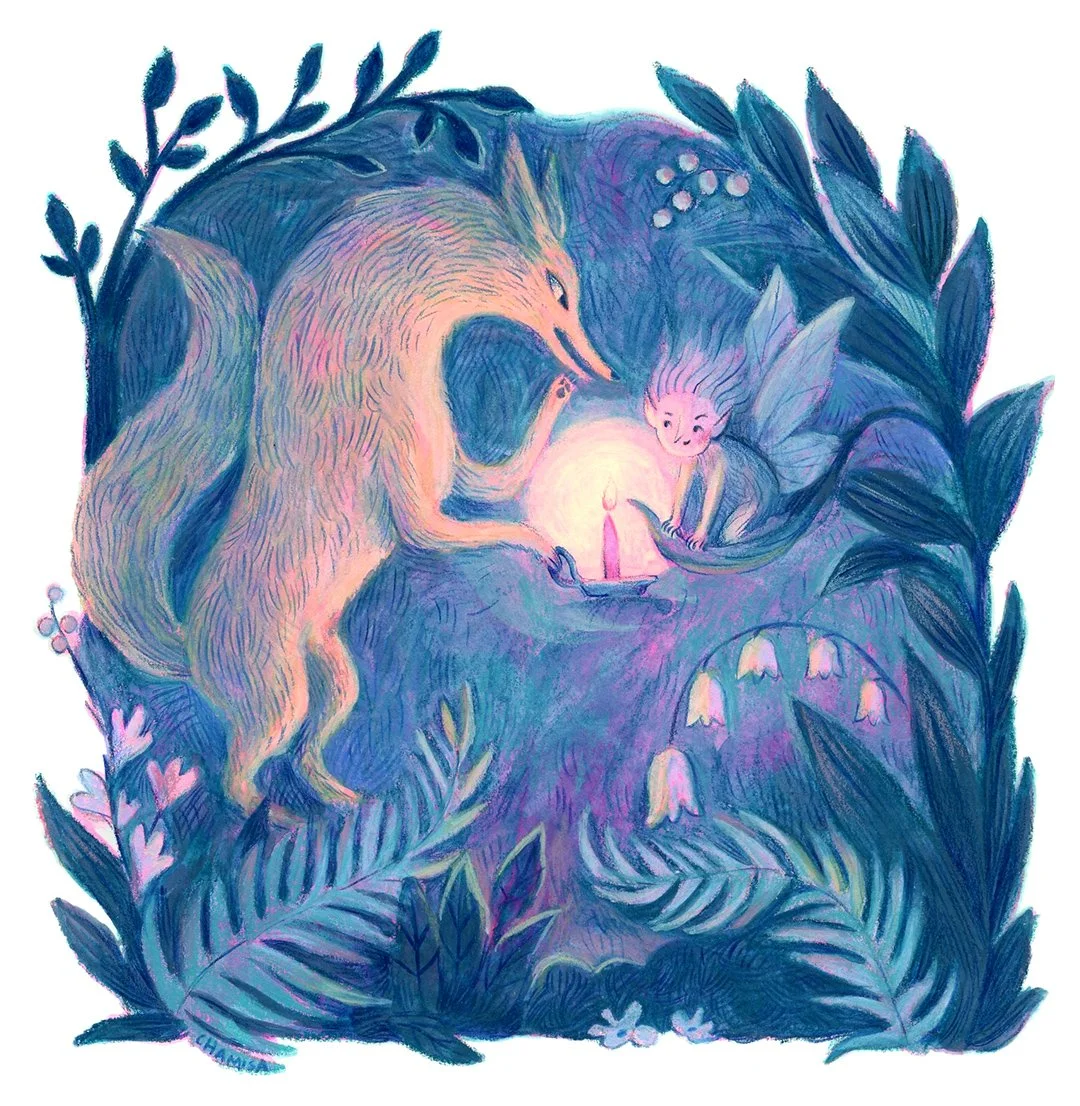
Final Artworks
I managed to stick to my goal of three paintings per week, and created twelve finished artworks! Some are much better than others, and it’s been interesting to see which ones people responded to on social media vs. the ones I personally like the best. Here they are in all their glory:
Since wrapping up this project, I have been more inspired to work with traditional materials and have a better idea of what I enjoy and what my process is, while still allowing for some room for experimentation and surprise.
Am I a digital or traditional artist? Do I have to choose??
The short answer here is a big NO! But I wanted to include this question at the end, because it’s something that has been a source of insecurity for me, and one that I’ve discussed with a lot of fellow illustrators. As professional artists, we know that having a distinctive and recognizable “voice” to our work is beneficial for our career and financial success. One of the basic rules of a portfolio is that it should show that you can consistently produce work at the same level of excellence and that it feels cohesive. Knowing this, it’s easy to get stuck in a mindset that your tools dictate your visual voice. This, I am constantly reminding myself, is just not true. Some of my favorite artists work across many mediums, even transitioning between 2D and 3D on occasion. The key is that they know what they want to say, and they have a sensibility that unites their work despite it being in multiple mediums, whether it’s the colors they gravitate towards, they’re choice of shape and line quality, or their subject matter. Also, artists evolve! We are humans that grow and change and keep pushing our own boundaries. This is what makes human-made art interesting. It’s not completely predictable, it invites us to look and learn and be surprised, tickled, comforted or even enraged. Whatever the feeling a piece of art invokes, it pulls at a deeper place in each of us, because it was created from a deeper place.
Wrap Up
In the end, I did use these artworks to make a 2026 calendar (now sold out, sorry!), and I’ve added many of them as prints in my shop if there are any that speak to you! As always, I’d love to hear any thoughts you might have about working across mediums, returning to traditional media after a long digital stretch, or anything else this discussion brings up for you. Let me know in the comments.